Charting Basics
Candlesticks
The two main charting methods used are bar graphs and candlestick charts. There is not much difference and it comes down to personal preference. I prefer candlestick charts because the shapes of the candles help to recognize events such as reversal and continuation formations, and reversal days. Candlesticks have been used for hundreds of years by the Japanese to track rice prices. They were introduced to the West by Steve Nison in his classic ’Japanese Candlestick Charting Techniques’. There are many variations of candlesticks but the three basic types of candles are: the up candle, the down and the neutral, or doji.
Up Candle
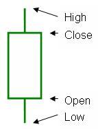
An up-candle is usually colored green (but sometimes blue). This is because green and blue are both associated with ‘growth’ colors. Green for trees and blue for blue skies and sunshine. The open of an up candle period is the bottom of the candle’s body. The close is the top of the body. The high and low of the period are represented by the highest and lowest points, or wicks, of the candle. When the high is the same price as the close, the upper wick will be missing. When the open is the same price as the low, the lower wick will be absent. See the chart below for an example.
Down Candle

The down candle is usually represented by a red colored candle. The high and low are the same as for an up candle, but the open and close are opposite. Therefore the open is represented by the top of the body and close by the bottom. When the open is the same price as the high, the upper wick will be absent. When the close is the same price as the low, the lower wick will be absent. See the chart below for an example.
Neutral Candle (Doji)
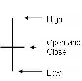
A neutral candle, or doji, occurs when the stock opens and closes at the same price, and is represented by a black candle. See the chart below for an example.
This is a very basic explanation. Different length bodies and wicks, as well as formations of two or three candles, represent different market psychology. The best source for learning about candlestick charting is the earlier mentioned book by Steve Nison: ’Japanese Candlestick Charting Techniques’. This comprehensive book covers a lot of information from the history to multiple day formations.
Support and Resistance
Support is the level at which a stock is likely to not fall below because there are buyers who missed out on purchasing the stock at that price last time before a rise, and are not waiting at that level to purchase. Once a stock breaks through support it is more likely to continue to fall to the next support level. Support lines are normally drawn onto the chart. See the chart below for an example.
Resistance is the level at which a stock is likely to pause at, as investors who did purchase at that price on the last rally, have been hoping the stock will return to that price after the stock has declined from the previous high to sell and recoup their losses. Once a resistance level is broken, a stock is likely to continue up until it meets the next resistance level. Resistance lines are also normally drawn onto the chart.
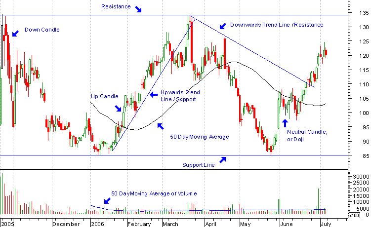
(click to enlarge)
Trend Lines
Trend lines depict the general direction that price movement on a chart is headed. They are drawn by connecting at least three low or high points as shown in the chart above.
Trend lines can also be used as support and resistance. In a down trend, a trend line that connects three high points is said to form resistance. Once the stock trades above (and preferably closes above) the trend line it has said to have broken through the resistance line. The same line will then offer support during a pullback.
In an uptrend, a trend line that connects three low points is said to form support. Once the stock trades below (and preferably closes below) the trend line it has said to have broken through the support line. The same line will then offer resistance during a subsequent rally.
Trend lines are used to form chart patterns and formations. These and breakouts from them are discussed more in Chart Patterns and Breakouts.
Volume
Volume is represented as a bar graph along the bottom of the chart and shows the number of shares that were traded during the period. Volume is an important indicator and so often overlooked by many traders. For further discussion on volume please see my article on Chart Patterns and Breakouts.
Moving Averages
Moving averages (MAs) are calculated by taking n periods, adding them up and dividing the sum by n. MAs can be simple, exponential or weighted. The two common MAs that I track are the simple 50 and 200 day MAs. The 50 represents a quarter (three months) and the 200 a year. This is because there are approximately 200 trading days in a year minus weekends and public holidays.
A stock transmits a warning sign when it closes below its 50 day MA, and should look to be sold when it penetrates below its 200 day MA. Also you should not consider purchasing a stock if it is trading below its 200 day MA.
I also plot a 50 day MA on the volume portion of my charts. When a stock breaks through overhead resistance during a 52 week high breakout, it is important for volume to expand to at least 50% above average to confirm institutional sponsorship. Once again, more discussion on this in my next article on Chart Patterns and Breakouts.
*Please leave any comments you may have at Reeholio Stock Market Trading Home Page
posted by Reeholio @ 8:28 PM
0 comments
![]()
![]()


0 Comments:
Post a Comment
<< Home